Bilderschriftbilder – zu Michael Endlichers Arbeiten
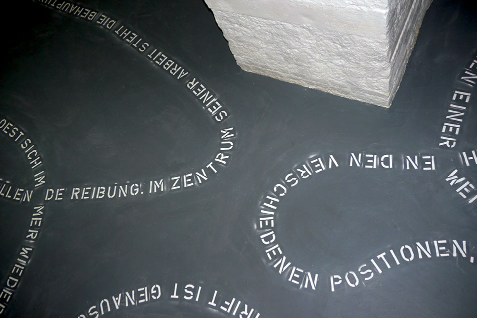
Michael Endlichers Arbeiten sind gute Beispiele für diese nicht enden wollende Reibung. Immer wieder neu verhandelt der Künstler die Dinge in dieser komplexen Verwobenheit, einmal liegt das Gewicht in einer Art reinen Malerei und die Buchstaben wirken wie Additionen aus einer anderen Welt, einmal ist nur noch das Format des Tafelbildes Träger der reinen Schrift. Dass er sich dabei nicht auf einen bestimmten Strang, auf ein reduziertes Programm einlassen will, liegt sozusagen in der Natur der Sache. Im Zentrum der Arbeit steht die Behauptung, dass die konzeptuelle Ebene der Form nicht eindeutig zuordenbar ist, das Bild nicht von der Rede über das Bild trennbar ist, die Rede nicht von der ausgelösten Emotion und die Emotion wiederum nicht von der Bildform. Gerade deshalb werden die Zuordnungen in den verschiedenen Varianten wieder und wieder durchgeführt. Dabei werden auch die Rollen ständig umverteilt, ein monochromes Bild spricht zu uns, erklärt etwas zur abstrakten Malerei und wir fragen uns gleichzeitig, was das Bild, die Farbfläche im Keilrahmen dann noch sagt. Durch solche Überladungen wird Endlichers Ansatz deutlich: Die Nummerntafeln auf den Kühlerhauben identifizieren das Abgebildete nochmals dadurch, dass darauf Autogeräusche durch Schrift repräsentiert sind. Eine Beziehung wird hergestellt, um dann durch das Herstellen einer weiteren wieder relativiert zu werden.
In den Arbeiten aus der Serie Dramenbleche wird die Wende zur Sprache wieder dadurch unterminiert, dass die drei Begriffe, die in Blechtafeln unter einer Nummer geprägt sind, in ihrer Zusammensetzung wieder etwas so Subjektives und Emotionales wie ein gestischer Pinselstrich an sich haben. Was von der äußeren Form her wie eine trockene Konzeptarbeit wirkt, ist auf der inhaltlichen Ebene dann wieder sehr offen und subjektiv. Trotzdem ziehen sich die Arbeiten niemals auf die Ebene einer reinen Poesie zurück, das analytische Handwerkszeug bleibt immer klar sichtbar. Die Schrift kommt oft wie eine Gebrauchsanweisung auf dem Bild daher, nur sind Gebrauchsanweisungen im Normalfall beigepackt und so nicht Teil dessen, zu dem sie anleiten. Die so entstehende Irritation weist immer wieder auf den unterschiedlichen und oft widersprüchlichen Gebrauch der Schrift in der Kunst des zwanzigsten Jahrhunderts zurück und letztendlich damit auch auf die ewige Problematik des Verhältnisses von Form und Inhalt in der Kunst ganz allgemein. Es geht ja tatsächlich in der Arbeit um alle möglichen Grenzen: zwischen Malerei und Text, zwischen Fläche und Form, zwischen Offenheit und Geschlossenheit, aber auch immer um jene zwischen Objekt und Konzept, Künstler und Kritiker, Kunst und Kritik. Michael Endlicher scheint alle diese Positionen wieder und wieder einzunehmen und dabei auf ihre Unhaltbarkeit hinzuweisen. In seinen Votivbildern bilden mehr oder weniger monochrom strukturierte Flächen einen Hintergrund für ausgestanzte Begriffspaare, die vertikal unterschiedlich angeordnet sind. Die Begriffspaare sind mehr oder weniger trivial, scheinen aus der Assoziation des Augenblicks entstanden. Diesem eher oberflächlichen Aspekt steht das Bild als Gegenstand der Anbetung gegenüber. Wieder sind es die Widersprüche, die die Begriffspaare multiplizieren und immer mehr Gegensätze entstehen lassen. Endlicher erzeugt einen dynamischen Fluss zwischen den verschiedensten Positionen, die entstehenden Überraschungen sind selbst nie fixiert, sie oszillieren zwischen schnellem Witz und tiefsinniger Analyse, ganz in der Art wie wir beim Betrachten oft fast gleichzeitig in ein Loch aus Farben hineingezogen werden und einen Text im Bild lesen, der uns in eine ganz andere Richtung zieht.
* Kursive Sätze wurden in der Bodeninstallation top level basement verwendet.
Martin Prinzhorn, 2008; Linguist, Essayist und Kritiker, Kurator, Wien
Bilderschriftbilder - on the works of Michael Endlicher
Seen from a historical perspective the use of script in the visual arts stands at the same time for and against abstraction.* In the first half of the 20th century the letter in a picture eventually stands for the non-figurative as the process of picture production in modernity. It either becomes part of the abstract language of form like a quasi-geometric figure or it is developed from the collage technique as a kind of hybrid between linguistic signifier and formal part of the picture. The formal aspect in any case always points in the direction of a reduction of the material content. This changed in the middle of the century, maybe due to Duchamp’s artistic practice, but certainly due to those artistic movements which regarded themselves in one way or the other as neighbouring on or succeeding to this practice, that is to say due to Surrealism, Fluxus, Conceptual Art and Pop Art. The script in the image is more or less restored to its original function of transmitting language and is thus extracted from the other forms of the pictures or opposes them. This is seen in classic works of conceptual art like Kosuth’s “One and Three Chairs” where object, image and linguistic definition (script) are presented separately and parallel to each other. In this case script opposes visual abstraction in so far as the context of the picture is regarded as too narrow, which implies that it should be replaced by other modes within the framework of visual art. By the time when John Baldessari has a poster artist transfer the text of a critic over the canvas of a painting, script as form of the picture does no longer play a genuine role. This act questions the existence of an autonomous language of art and the script becomes the signifier of the impossibility of such autonomy. At the same time and executed in an ironic manner in these works, the relationship between art and critique or interpretation is being dealt with: wherever script in its linguistic function becomes part of the image, any understanding of the image is no longer possible without an understanding of the text, thus leading to the possible conclusion that art can no longer be understood without extra-artistic references. The issue that, at the time, was negotiated in a playful and ironic way is still relevant and leads to the rather helpless attempt to make a distinction between referential art and other forms of art. In this way script as well as artistic representation in general is in the centre of the debate on the essence of art and the essence of the image. At the same time one must not forget that some thousand years before the script underwent a parallel process that can definitely be compared to the process of visual abstraction in modernity: in the beginning there were also pictures which were abstracted to signs for phonetic sequences and finally to single sounds. However, the comparison does not work for the result: through systematic combination with others a letter can always move back to a linguistic figure. But the monochrome picture? As analytically as such a debate can be lead within art, even so art finally defies such simple reductions. The dynamics are so strong that one cannot simply stop at a certain point. In the long run figures can never be permanently regarded as figures, just as abstractions do not have to remain abstractions. For this reason the relation between script and image in art always dissolves in a playful aesthetic.
Michael Endlicher’s works are good examples for this never-ending friction. Over and over again the artist negotiates things in this complex interwovenness, once focussing on a somehow pure painting where letters appear like additions from a different world, then again only the format of the panel carries pure script. It is, as it were, in the nature of the case that in doing so he does not want to engage with a certain strand, a reduced programme. The work revolves around the claim that the conceptual level cannot be definitely assigned to the form, that the image cannot be separated from what is said about it, that what is said cannot be separated from the emotion that is evoked and, in turn, the emotion not from the form of the image. For that very reason different allocations are put into effect in different variations. Thereby roles are also constantly redistributed, a monochrome picture talks to us declaring something to be abstract painting and at the same time we are wondering what else the picture, the colour plane in a stretcher frame, might be saying. Endlicher’s approach becomes clear by the way in which his works are overloaded: number plates on the bonnet once again identify what has been illustrated by showing script representing the sounds of cars. The relation that has been established is relativized by the establishment of another one.
In the works from the series “Metal Dramas” a turn to language is again undermined by the fact that the three terms, which are embossed in a metal plate under a certain number, are put together in such a way that they appear as subjective and emotional as a gestural brush-stroke. What the external form makes appear like a prosaic conceptual work becomes very open and subjective regarding content. However, these works never withdraw to a level of pure poetry but their analytical tools always remain visible. Frequently script appears on a picture like a set of instructions apart from the fact that instructions are usually enclosed and not a part of what they are meant to explain. Thus an irritation is created that again and again points back to the diverse and often contradictory use of script in the art of the 20th century and eventually to the eternal problem of the relationship between form and content in art in general. This work actually deals with all kinds of boundaries: between painting and text, between plane and form, between openness and closeness, but also with those between object and concept, artist and critic, art and critique. Michael Endlicher seems to adopt all those positions again and again and in doing so he points out that they are all untenable.
In his “Votive Paintings”, more or less monochromatically structured planes provide the background for pairs of concepts that have been stamped out and arranged vertically in different ways. The concept pairs are more or less trivial, seemingly created from the association of a moment. This rather superficial aspect is opposed by the picture as an object of adoration. Once again contradictions multiply the pairs of concepts and thus create more and more opposites. Endlicher creates a dynamic flow between the most diverse positions, where also the surprises that are created in this process never become completely fixed but oscillate between quick joke and profound analysis, just the way we are often almost drawn into a hole of colours while at the same time reading a text in the picture that draws us into a completely different direction.
* Sentences in regular type – of course in German – were used for the installation top level basement .
Martin Prinzhorn, 2008. Linguist, essayist and curator, Vienna